S Mark Gubb: Good Sailing…
5 NOV — 18 MARCH 2012
 |
S Mark Gubb, Good Sailing... Image (c) Mark McNulty
The first in a series of new work displayed on the exterior wall of Open Eye Gallery.
Gubb’s design incorporates dazzle camouflage, used extensively during the First World War as a paint scheme for warships to confuse the enemy.
The technique made it difficult to estimate the size, speed and direction ships were travelling by using a complex pattern of geometric shapes in contrasting colours.
Over the top of the dazzle camouflage, Gubb has used the last words of revolutionary American poet, natural scientist and historian Henry David Thoreau: “Now comes good sailing…” The first in a series of striking new commissions for the exterior façade of the new Open Eye Gallery.
S Mark Gubb was born in Romsey, 1974. Solo exhibitions include Chapter Arts Centre, Cardiff; Aspex in Portsmouth; and Ceri Hand Gallery, Liverpool. Group exhibitions include SEVENTEEN, London; Matthew Bown Gallery, Berlin; and Talbot Rice Gallery, Edinburgh.
S Mark Gubb lives and works in Cardiff. He is represented by Ceri Hand Gallery, London.
Wall Work sponsored by Signs 2000 Ltd.
Paul Morrison: Urformen
June 2014 - 2016

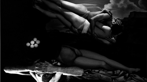
Paul Morrison, Urformen ©
As part of the Cultural Programme of the International Festival for Business 2014, Open Eye Gallery has commissioned Liverpool-born artist Paul Morrison (b. 1966) with a new work that will transform the gallery’s façade. Every two years, made to coincide with the Liverpool Biennial, the Wall Work series aims to create a new visual dialogue between the gallery and its context, and collaborate with artists who work outside the field of photography and lens-based practices.
Urformen is a cognitive landscape created from a selection of disparate found elements, which are taken from Morrison’s archive. His source material ranges from archaic prints to contemporary graphics found in botanical text books, fine art, film stills and advertising.
The images are integrated through digital manipulation and form an indeterminate space that is simultaneously flat, yet gives the illusion of strong pictorial depth.
The resulting composition functions as a screen that allows the viewer to complete the landscape according to her/his perception, history, memory and cultural associations. It is a virtual site for an incident to occur in.
The contrasting black and white heightens the work’s visual impact. However, the piece is somehow rich in associative colour. A picture of grass need not be green any more than the word rainbow needs to be written in multi-coloured letters.
Sponsored by the International Festival For Business 2014.