 |
| Above: Tokuriki, Tomikichiro, The Cherry Blossoms of Mt. Shigi in Nara Prefecture (The Eight Views of Japan), n.d. (c. 1950s), Color woodblock print (oban). Smart Museum of Art, The University of Chicago, Gift of Brenda F. and Joseph V. Smith, 2004.178b. |
So, this post will be an introduction on Japanese Woodblock Printing that I had experienced today with Jennifer Lynch. I will be listing the main genres and terms of printing and their translations, a step by step process with the use of materials, techniques and processes with some examples of each in traditional Japanese prints and comparing and contrasting them with contemporary Japanese art.
Woodblock prints were initially used as early as the eighth century in Japan to disseminate texts, especially Buddhist scriptures. The designer and painter Tawaraya Sotatsu (died ca. 1640) used wood stamps in the early seventeenth century to print designs on paper and silk. Until the eighteenth century, however, woodblock printing remained primarily a convenient method of reproducing written texts.
In 1765, new technology made it possible to produce single-sheet prints in a whole range of colors. Printmakers who had heretofore worked in monochrome and painted the colors in by hand, or had printed only a few colors, gradually came to use full polychrome painting to spectacular effect. The first polychrome prints, or nishiki-e, were calendars made on commission for a group of wealthy patrons in Edo, where it was the custom to exchange beautifully designed calendars at the beginning of the year.
A woodblock print image is first designed by the artist on paper and then transferred to a thin, partly transparent paper. Following the lines on the paper, now pasted to a wooden block usually of cherry wood, the carver chisels and cuts to create the original in negative—with the lines and areas to be colored raised in relief. Ink is applied to the surface of the woodblock. Rubbing a round pad over the back of a piece of paper laid over the top of the inked board makes a print.
Polychrome prints were made using a separate carved block for each color, which could number up to twenty. To print with precision using numerous blocks on a single paper sheet, a system of placing two cuts on the edge of each block to serve as alignment guides was employed. Paper made from the inner bark of mulberry trees was favored, as it was strong enough to withstand numerous rubbings on the various woodblocks and sufficiently absorbent to take up the ink and pigments. Reproductions, sometimes numbering in the thousands, could be made until the carvings on the woodblocks became worn.
Technical Print Terms
Ehon –
‘Picture books’
Hōsho –
‘Presentation paper’ a high quality paper
Mino
paper –
popular paper for prints before full colour printing was invented
Chūban –
‘Medium format’
Hashira-e –
‘Pillar pictures’ long, narrow format
Koban –
‘Small format’
Ōban –
‘Large format’
Nishiki-e –
‘Brocade pictures’ full colour prints
Sumizuri-e –
prints made entirely with black ink
Print Genres
•Ukiyo-e – ‘Pictures of the Floating World’
•Bijinga – ‘Pictures of Beautiful Women’
•Fūkei-ga – Images of landscapes
•Historical and Mythological
•Kachô-e – Images of birds and flowers
•Okubi-e – ‘Large Head Pictures’ bust portraits
•Shunga – ‘Spring Pictures’
•Yakusha-e – Kabuki actor prints
•Surimono – privately published prints not sold to the general public
Production of Japanese Prints
The production of classic Japanese woodblock prints is a fairly complex process, involving a number of steps, each usually performed by a different person, one skilled in that particular step.I say "classic" because in the modern Japanese print movement, often the artist performs all the steps themselves. However, while classic Japanese prints were sometimes produced in limited editions as 'high art', more usually they were produced in far larger editions as popular, mass-produced art, art that was originally intended to be transitory.
As such, the production process rapidly evolved into one with various specialties, and during the hey-day of ukiyo-e, it was not uncommon for different steps to be performed in different establishments, each with a particular speciality.
As such, the production process rapidly evolved into one with various specialties, and during the hey-day of ukiyo-e, it was not uncommon for different steps to be performed in different establishments, each with a particular speciality.
The artist would start by producing a preparatory sketch (gako), with the most detail in areas like faces, etc. He (and it was usually a 'he', although a few female woodblock artists are known from the pre-Meiji period) would make alterations and corrections by gluing new paper over the desired areas.
The artist would then pass this drawing to a block-copyist, who then made an elaborated final copy, a very fine black and white paper drawing, the hanshita-e ('under-drawing', sometimes given as shita-e) on very thin mino paper, which showed the (usually black) lines which outlined everything in the image. (This copying process explains why so many original sketches for prints are still extant, since thehanshita-e was destroyed in the process of creating the blocks, as we will see.)
The completed drawing would then be shown to the official censors, and after being passed, it would go to a carver, who specialized in carving the blocks used to produce the print.

The Printers
The grinding of pigments was one of the steps traineee printers had to master; each was kept in its own porcelain bowl, and before use a few drops of water would be added to produce exactly the right consistency. Also, a stack of one of two kinds of mulberry (kozo) paper would be slightly moistened, and laid ready to hand.
The printing was done in fairly straightforward fashion; ink was applied to the block, which was face up, using brushes (hake) made from a horse's mane. Rice-starch was sometimes added to the block, to give better adhesion and color depth.
The paper was then laid down on the block, using the kento to line it up, and the ink was rubbed onto the paper using a circular or semi-circular motion.
The rubbing was done using a baren, a large circular flat pad, usually made of a bamboo sheath wrapped around a lacquered cover over a flat coil of straw and/or bamboo fiber, or some similar material; the strands of the coiled fiber produced an uneven surface which was important in pressing the ink into the paper.
The shading (called bokashi) is produced by a number of different techniques, such as:
- wiping the blocks with a cotton cloth or pad after the application of the ink;
- using brushes with varying color intensity and moisture level;
- rubbing the block with a damp cloth before applying the ink.
Repeat Printing
Actually, sometimes a block would get used more than once, as partial (i.e. the block is not completely inked, but only in one area, with a shading out to no ink on other parts of the block) overprints of an emphasis color.Ironically, it appears that this technique appeared in response to sumptuary regulations passed by the Tokugawa Shogunate during the Tempo Reforms of the early 1840's, which limited the number of blocks which could be used in making prints!
You can see this technique being used in many prints, especially ones that show sky or water; in the middle or the edge of the water, which is generally light blue, there will be a band of dark blue water. This whole area would have originally been printed in the light blue ground color, and then that part overprinted in the deeper blue.
It can get even more complex, though. It is fairly common to take a block which is used to print a basic sky color (e.g. light blue-grey), and overprint with it twice after the initial printing; the first time with a one accent color (e.g. deeper blue) along the lower edge, and the second with another accent color (e.g. a black) along the upper edge. Even so, a complete print can use a large number of blocks.
Note that in a number of stages, a block which was used in a previous stage is used again, to overprint an accent color, always using bokashi to grade it in.
Even with the repeat printing, the little book used 10 blocks, with two being overprinted twice, for a total of 14 separate printing stages.
The process starts with the key block (note that for this, as well as all the images below, you can get a larger image by clicking on the image):
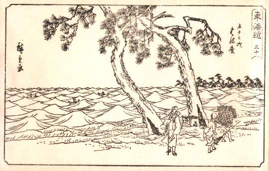
Now we add the rest of the blocks:
| Stage | Print Block | Cumulative Print |
|---|---|---|
| 1 - Brown |  | 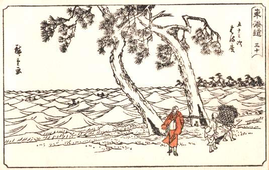 |
| 2 - Pinkish Brown | 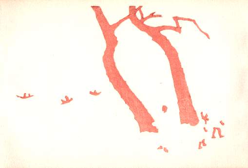 | 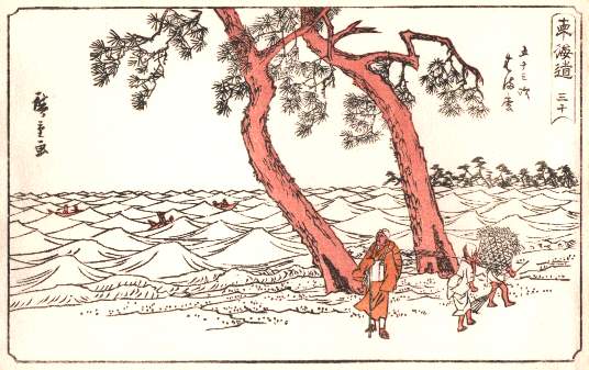 |
| 3 - Grey | 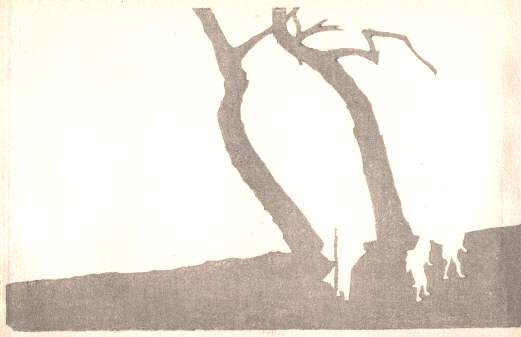 | 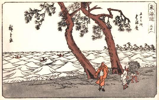 |
| 4 - Bluish Grey | 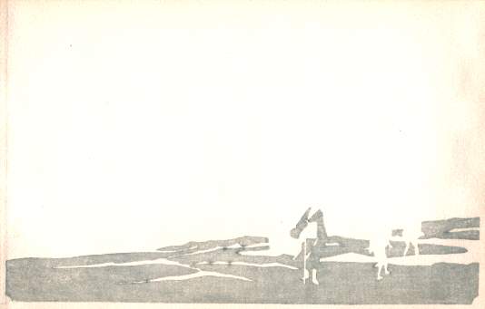 | 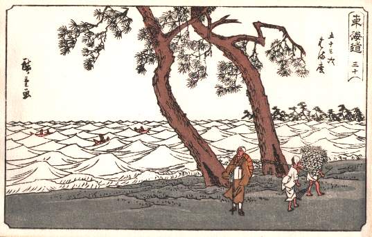 |
| 5 - Light Blue |  | 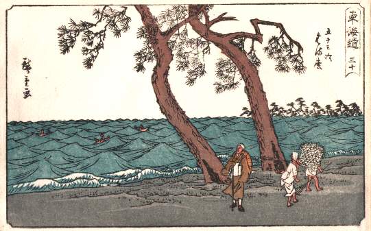 |
| 6 - Grey (same color as stage 3) | 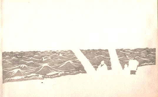 | 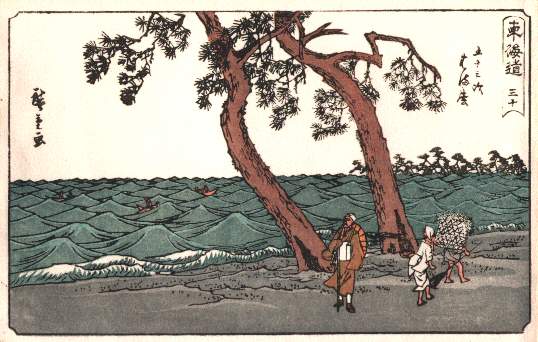 |
| 7 - Dark Blue (same block as stage 5) | 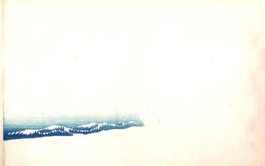 | 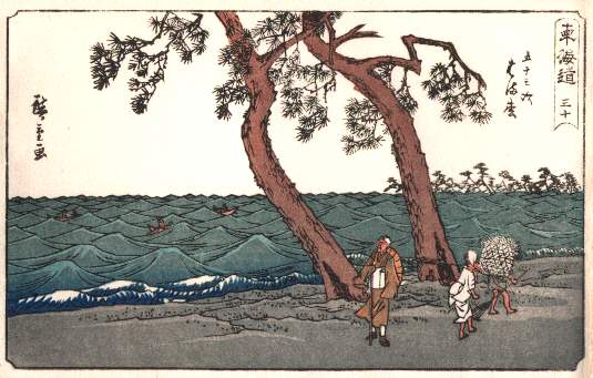 |
| 8 - Dark Blue (same block as stage 5) | 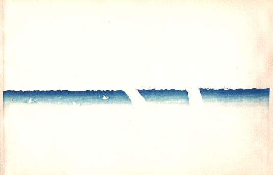 | 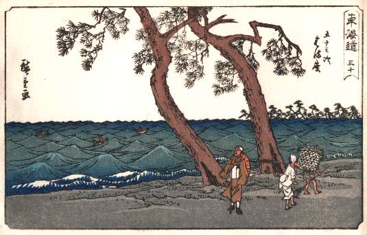 |
| 9 - Grey-Blue | 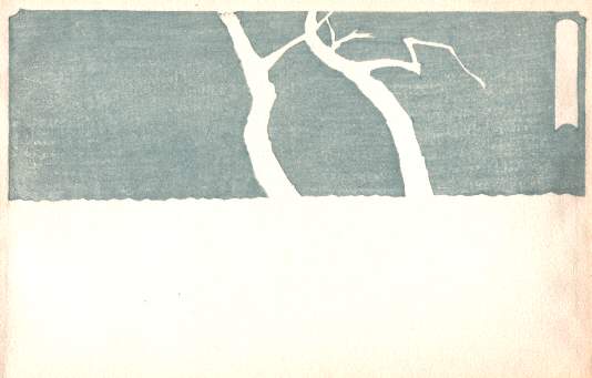 | 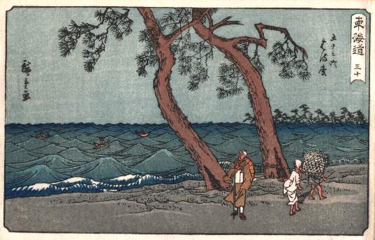 |
| 10 - Green |  | 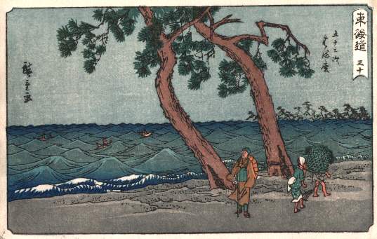 |
| 11 - Light Blue (same block as stage 9) |  | 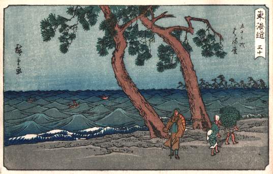 |
| 12 - Black (same block as stage 9) |  | 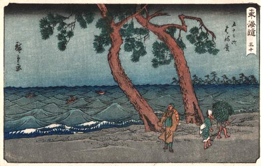 |
| 13 - Red |  | 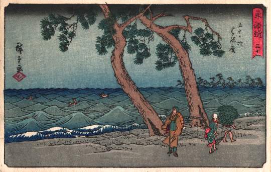 |
New Prints and Contemporary Woodblock artists
When the traditional art of the Japanese color woodblock print was pushed near extinction at the turn of the twentieth century, a few enterprising young artists and publishers revived the old-fashioned art form. These shin hanga or "new prints" maintained traditional methods and depicted traditional birds, flowers, and landscapes, but this long-established art found a new audience in Western collectors attracted by the powerful and alluring images of Japan. Wildly popular in Europe and the United States, many of these prints were created for sale abroad and even designed with foreign tastes in mind. This exhibition brought together a selection of fukeiga(landscapes) and kachoga (bird and flower) shin hanga from the Smart Museum's collection.
The Ronin Gallery in New York displays many of the modern and traditional woodblock prints check out their website: http://www.japancollection.com/japanese-prints-home.php
Contemporary Artist- Ralph Kiggell
 | ||||||
|
A modern and contemporary artist: Ralph Kiggell still uses the traditional woodblock printing
methods in his work today.
methods in his work today.
Ralph Kiggell is an English artist who lives in Thailand most of the time. He was born in 1960 and
completed a BA at the School of Oriental and African Studies, London, before pursuing his art
studies in Japan. In Japan, he studied Ukiyoe printmaking at the famous Yoshida print studio. He
then researched contemporary woodblock printing and related techniques at Kyoto Seika University
before completing an MA in printmaking at Tama Art University in Tokyo. Kiggell has long been
fascinated by the Japanese woodblock print and has experimented and developed his own methods
and techniques based on Japanese traditions.
His current works are hand printed on Japanese hand made paper with his own mix of Japanese
pigments. He says: "The most important reason why I like woodblock printing is that it uses natural
materials and is sensitive to the environment.
pigments. He says: "The most important reason why I like woodblock printing is that it uses natural
materials and is sensitive to the environment.
The second is that I was interested in the Japanese aesthetic, which is superbly represented in
Japanese woodblock prints of the last 400 years. Thirdly, as any artist who has printed knows, there
is something compelling about carving a design on one material and transferring it to another."
Japanese woodblock prints of the last 400 years. Thirdly, as any artist who has printed knows, there
is something compelling about carving a design on one material and transferring it to another."
Kiggell has completed two recent major projects: colourium and second nature, in which he focuses
on nature and on animals and objects that fascinate him.
on nature and on animals and objects that fascinate him.
To see more of his works visit: www.ralphkiggell.com/


