Pages

Friday, 23 January 2015

Modern-Day Contemporaries

Cardboard forest by Eva Jospin.

Hellooo everyone,

So this week I've been researching at the diverse range of contemporary art that The National Art Society show on their Facebook page. For those that already know me, I easily dismiss anything that comes into conversation with 'Contemporary art' because if your a museum/ art gallery regular like me, your used to seeing colour block monochrome canvasses and the usual pointless alien-like dot in the middle of a blank canvas in the likes of the Tate whereas you get the more traditional and meaningful paintings in art galleries in Manchester and The Walker (Liverpool's Baltic Triangle).

But now, my tastes in contemporary art have developed, engaging in 'meaningful' 'interesting' pieces of work that artists today have brought out. So in this post (and a few others) I'm not going to ramble on about what I think should be considered as art, instead I'm going to introduce you to a few modern day contemporaries that I discovered this week!

Cardboard Forest by Eva Jospin (Above) was one of the installations I found fascinating. Personally I love trees and to just see the intricacy and detail and time she's put into this makes me interested in finding out more about her work. 


Graduate of the Beaux-Arts Academy in Paris, Eva Jospin has been dedicating herself for several years to the question of the landscape and its representation. More recently, the artist, through a unique medium, the cardboard, sculpts large “Forest”.


The correlations between this material and the represented subject, are both logical and conflicting. Eva Jospin explains that she  approaches the cardboard on its oppositions. This raw, surly support and of fragile appearance, is going to be mastered, tamed, as ennobled for, in the term of this creative process, to ( re ) become a tree and to embody so the solidity of a trunk as the delicate complexities of a forest. 

That is why Dominique Païni wrote about this work:" Eva Jospin forgets nothing of the stake which is lying at the bottom of these undergrowth, foliage and clearings: restore an unlimited mess, exceed by the virtuosity of the lifting and the cut the illusions of the depth, experiment the limits of a frame and a surface to deceive the eye. "


For her first personal exhibition in France, the artist, who conceives her works as a space of projection, declines the forms and the density of forests, and investigates the inexhaustible poetic imagination which they arouse.
The big Forest shown at the Galerie Pièce Unique occupies a large part of the space, it embraces literally the vision of the spectator. In a glance, the magic of the work operates. Almost in spite of him, the passer-by is snatched by the power suggestive of this natural element; the more the eyes dive into the strata of boughs and foliages, and the more his spirit gets lost. Because, indeed, to take back here again Dominique Païni's words: " get lost: is not it the only danger which becomes attached to this natural labyrinth that is a forest?"  
Every night, the sculpture will be differently perceived thanks to a progressive lighting.
In the Galerie Pièce Unique Variations, Eva Jospin varies the scales and perturbs our sensations. There, another vast forest, exhibited separately in a room, brings us to observe the variety of these  monochrome plants, and to feel the peculiarity of their suggestive strength.
In the rest of the space, Eva Jospin presents for the first time small formats, for her "contrary to the big forests which create an effect of depth and a sensation of  loss of marks , these works plunge us in the heart of a plant profusion  details of which possess the precision of a giant herbarium".


Monday, 5 January 2015

Jeremy Mann

Landscapes

The Bay Composition #7.jpg

grey fog 1.jpg

Evening over the Fields.jpg

Red Harbor.jpg


Distant Lights from the Bay.jpg

Morning at Thousand Islands Lake.jpg

Bay Evening.jpg

Cityscapes

  "Manhattan Nights" - 48 x 48 in. Oil on Panel 2013

marketstnightingreen.jpg

the alley.jpg

103.jpg

An Introduction to Seb Patane

Frieze Art Fair - Focus Section, Fonti, London October 2013

Erwin Piscator, Gera, January 1915
mixed media
dimensions variable
2013
Hi everyone!

Just a quick post to discuss emerging music influenced and installation artist Seb Patane. His work sums up relations to history, how people react to them and visual language. This is all interpreted through many mediums such as: drawing, photography, collage, performance, sound and video; all distinguishing violence in sculpture and correlations between peoples aspect of viewing.

The playful connotations of his mediums suggest to me that he is trying to promote his work in almost every way, given that he is interested in archives, narratives and principles. The historical references that he has developed into his collages, performances and photographs suggest eras of the first world war with comparisons to the Victorian era to show contrasts of past life to real life.


RIGHT: Seb Patane, Evening (featuring James Beckett), 2014
Sound, 2'48"
Although Patane is more interested in his sound installations. Experimenting with lengths of sound installations and extending his working practice. "Its almost expressive in ways of how you can feed people information and how you are going to do that" I personally love his "Evening" sound collage including James Beckett.As it sounds almost historical like a ceremony is present. dark and high tempos with distinct sounds. Reminded me of some of the almost magical and eerie sounds of Tangerine Dream. (there's no video uploaded on his website as yet)

Check out his "400 Sonnets In Reverse, Together" that is quite similar to "Evening" http://www.thewire.co.uk/video/p=15188  

Japanese Woodblock Printing with Jennifer Lynch

Above: Tokuriki, Tomikichiro, The Cherry Blossoms of Mt. Shigi in Nara Prefecture (The Eight Views of Japan), n.d. (c. 1950s), Color woodblock print (oban). Smart Museum of Art, The University of Chicago, Gift of Brenda F. and Joseph V. Smith, 2004.178b.
Helloooo everyone! First of all Happy New Year! I haven't been able to post for a while because of my Christmas painting commissions, which I will post onto my personal blog (I'll attach the link below).

So, this post will be an introduction on Japanese Woodblock Printing that I had experienced today with Jennifer Lynch. I will be listing the main genres and terms of printing and their translations, a step by step process with the use of materials, techniques and processes with some examples of each in traditional Japanese prints and comparing and contrasting them with contemporary Japanese art.


Woodblock prints were initially used as early as the eighth century in Japan to disseminate texts, especially Buddhist scriptures. The designer and painter Tawaraya Sotatsu (died ca. 1640) used wood stamps in the early seventeenth century to print designs on paper and silk. Until the eighteenth century, however, woodblock printing remained primarily a convenient method of reproducing written texts.


In 1765, new technology made it possible to produce single-sheet prints in a whole range of colors. Printmakers who had heretofore worked in monochrome and painted the colors in by hand, or had printed only a few colors, gradually came to use full polychrome painting to spectacular effect. The first polychrome prints, or nishiki-e, were calendars made on commission for a group of wealthy patrons in Edo, where it was the custom to exchange beautifully designed calendars at the beginning of the year.

A woodblock print image is first designed by the artist on paper and then transferred to a thin, partly transparent paper. Following the lines on the paper, now pasted to a wooden block usually of cherry wood, the carver chisels and cuts to create the original in negative—with the lines and areas to be colored raised in relief. Ink is applied to the surface of the woodblock. Rubbing a round pad over the back of a piece of paper laid over the top of the inked board makes a print.

Polychrome prints were made using a separate carved block for each color, which could number up to twenty. To print with precision using numerous blocks on a single paper sheet, a system of placing two cuts on the edge of each block to serve as alignment guides was employed. Paper made from the inner bark of mulberry trees was favored, as it was strong enough to withstand numerous rubbings on the various woodblocks and sufficiently absorbent to take up the ink and pigments. Reproductions, sometimes numbering in the thousands, could be made until the carvings on the woodblocks became worn.

Technical Print Terms

Ehon – ‘Picture books’
Hōsho – ‘Presentation paper’ a high quality paper
Mino paper – popular paper for prints before full colour printing was invented
Chūban – ‘Medium format’
Hashira-e – ‘Pillar pictures’ long, narrow format
Koban – ‘Small format’
Ōban – ‘Large format’
Nishiki-e – ‘Brocade pictures’ full colour prints

Sumizuri-e – prints made entirely with black ink

Print Genres

•Ukiyo-e – ‘Pictures of the Floating World’
•Bijinga – ‘Pictures of Beautiful Women’
•Fūkei-ga – Images of landscapes
•Historical and Mythological
•Kachô-e – Images of birds and flowers
•Okubi-e – ‘Large Head Pictures’ bust portraits
•Shunga – ‘Spring Pictures’
•Yakusha-e – Kabuki actor prints

•Surimono – privately published prints not sold to the general public

Production of Japanese Prints


The production of classic Japanese woodblock prints is a fairly complex process, involving a number of steps, each usually performed by a different person, one skilled in that particular step.I say "classic" because in the modern Japanese print movement, often the artist performs all the steps themselves. However, while classic Japanese prints were sometimes produced in limited editions as 'high art', more usually they were produced in far larger editions as popular, mass-produced art, art that was originally intended to be transitory.

As such, the production process rapidly evolved into one with various specialties, and during the hey-day of ukiyo-e, it was not uncommon for different steps to be performed in different establishments, each with a particular speciality.

The artist would start by producing a preparatory sketch (gako), with the most detail in areas like faces, etc. He (and it was usually a 'he', although a few female woodblock artists are known from the pre-Meiji period) would make alterations and corrections by gluing new paper over the desired areas.
The artist would then pass this drawing to a block-copyist, who then made an elaborated final copy, a very fine black and white paper drawing, the hanshita-e ('under-drawing', sometimes given as shita-e) on very thin mino paper, which showed the (usually black) lines which outlined everything in the image. (This copying process explains why so many original sketches for prints are still extant, since thehanshita-e was destroyed in the process of creating the blocks, as we will see.)
The completed drawing would then be shown to the official censors, and after being passed, it would go to a carver, who specialized in carving the blocks used to produce the print. 


        The Printers

The third set of artisans were the printers, skilled in making the inks (both vegetable and mineral inks were used), and applying them, especially to get the shading (called bokashi).
The grinding of pigments was one of the steps traineee printers had to master; each was kept in its own porcelain bowl, and before use a few drops of water would be added to produce exactly the right consistency. Also, a stack of one of two kinds of mulberry (kozo) paper would be slightly moistened, and laid ready to hand. 

The printing was done in fairly straightforward fashion; ink was applied to the block, which was face up, using brushes (hake) made from a horse's mane. Rice-starch was sometimes added to the block, to give better adhesion and color depth. 
The paper was then laid down on the block, using the kento to line it up, and the ink was rubbed onto the paper using a circular or semi-circular motion. 

The rubbing was done using a baren, a large circular flat pad, usually made of a bamboo sheath wrapped around a lacquered cover over a flat coil of straw and/or bamboo fiber, or some similar material; the strands of the coiled fiber produced an uneven surface which was important in pressing the ink into the paper.


The shading (called bokashi) is produced by a number of different techniques, such as:
    • wiping the blocks with a cotton cloth or pad after the application of the ink;
    • using brushes with varying color intensity and moisture level;
    • rubbing the block with a damp cloth before applying the ink.

Repeat Printing

Actually, sometimes a block would get used more than once, as partial (i.e. the block is not completely inked, but only in one area, with a shading out to no ink on other parts of the block) overprints of an emphasis color.

Ironically, it appears that this technique appeared in response to sumptuary regulations passed by the Tokugawa Shogunate during the Tempo Reforms of the early 1840's, which limited the number of blocks which could be used in making prints!

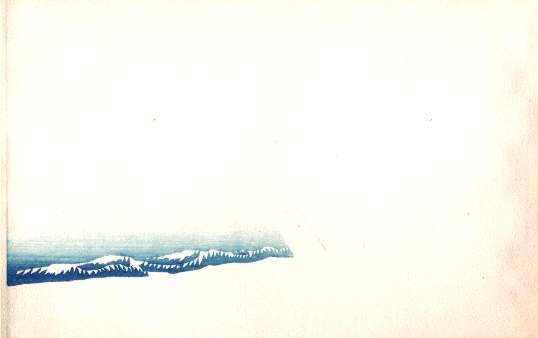
You can see this technique being used in many prints, especially ones that show sky or water; in the middle or the edge of the water, which is generally light blue, there will be a band of dark blue water. This whole area would have originally been printed in the light blue ground color, and then that part overprinted in the deeper blue.


It can get even more complex, though. It is fairly common to take a block which is used to print a basic sky color (e.g. light blue-grey), and overprint with it twice after the initial printing; the first time with a one accent color (e.g. deeper blue) along the lower edge, and the second with another accent color (e.g. a black) along the upper edge. Even so, a complete print can use a large number of blocks.

Note that in a number of stages, a block which was used in a previous stage is used again, to overprint an accent color, always using bokashi to grade it in.
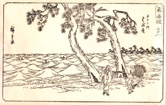
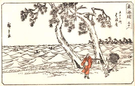
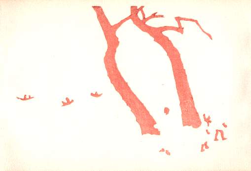
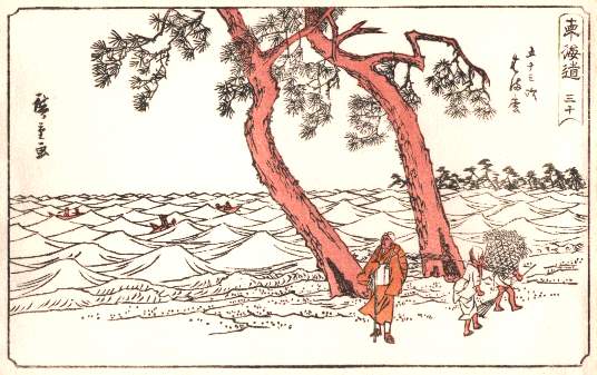
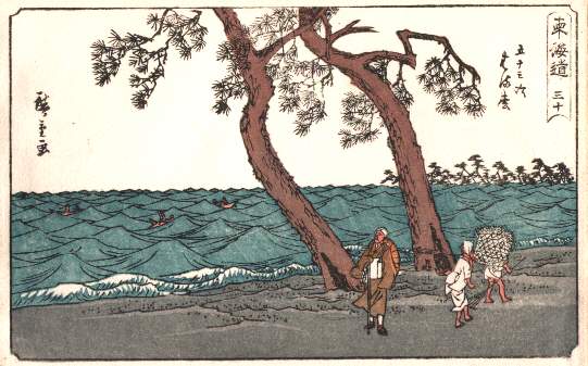
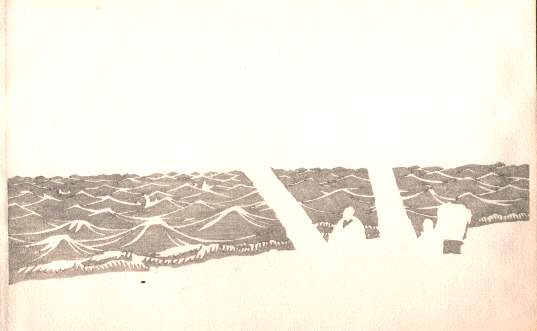
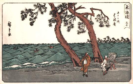
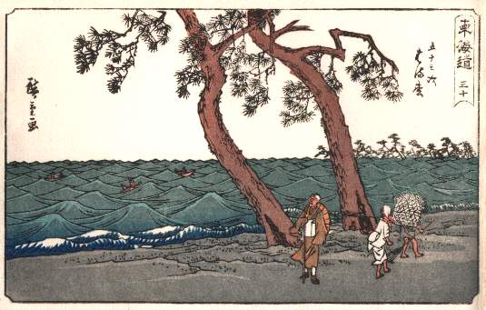
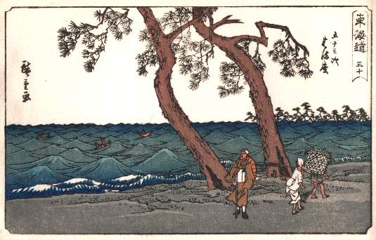
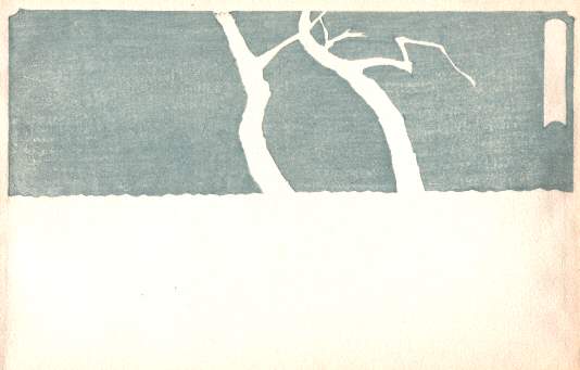
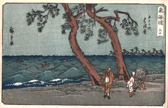
Even with the repeat printing, the little book used 10 blocks, with two being overprinted twice, for a total of 14 separate printing stages.

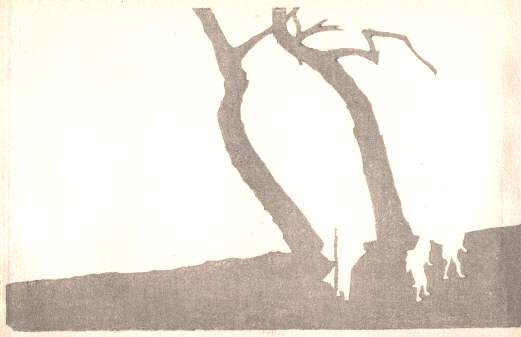
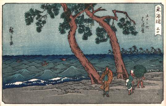
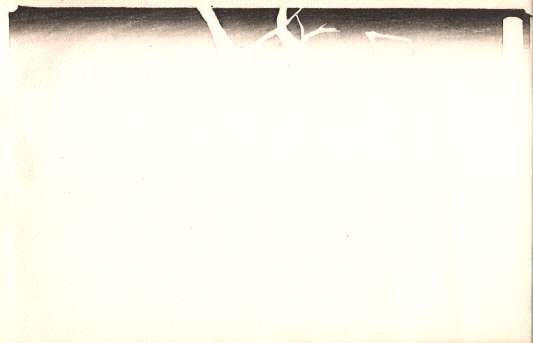
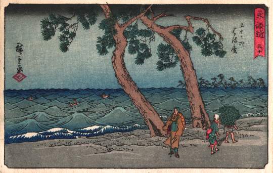
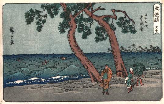
The process starts with the key block (note that for this, as well as all the images below, you can get a larger image by clicking on the image):

Key Block

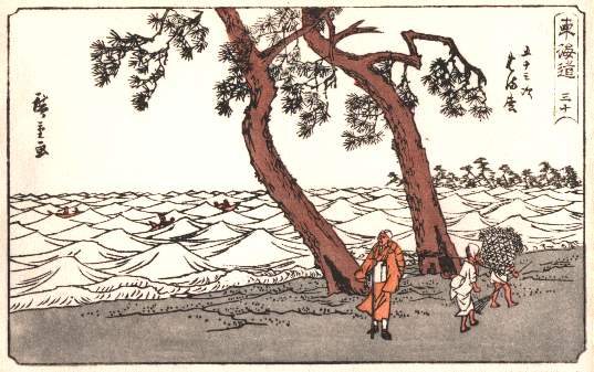
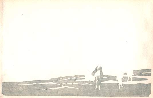
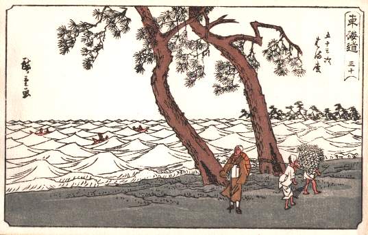
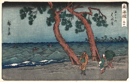
Now we add the rest of the blocks:
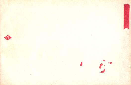
StagePrint BlockCumulative Print
1 - Brown1st StageStage 1
2 - Pinkish Brown2nd StageStage 2
3 - Grey3rd StageStage 3
4 - Bluish Grey4th StageStage 4
5 - Light Blue5th StageStage 5
6 - Grey (same color as stage 3)6th StageStage 6
7 - Dark Blue (same block as stage 5)7th StageStage 7
8 - Dark Blue (same block as stage 5)8th StageStage 8
9 - Grey-Blue9th StageStage 9
10 - Green10th StageStage 10
11 - Light Blue (same block as stage 9)11th StageStage 11
12 - Black (same block as stage 9)12th StageStage 12
13 - Red13th StageStage 13


New Prints and Contemporary Woodblock artists

When the traditional art of the Japanese color woodblock print was pushed near extinction at the turn of the twentieth century, a few enterprising young artists and publishers revived the old-fashioned art form. These shin hanga or "new prints" maintained traditional methods and depicted traditional birds, flowers, and landscapes, but this long-established art found a new audience in Western collectors attracted by the powerful and alluring images of Japan. Wildly popular in Europe and the United States, many of these prints were created for sale abroad and even designed with foreign tastes in mind. This exhibition brought together a selection of fukeiga(landscapes) and kachoga (bird and flower) shin hanga from the Smart Museum's collection.
The Ronin Gallery in New York displays many of the modern and traditional woodblock prints check out their website: http://www.japancollection.com/japanese-prints-home.php 

Contemporary Artist- Ralph Kiggell


Artist: Ralph KiggellTitle: Orb
Year: 2011Technique: Woodblock print on Japanese handmade paper, ed 8
Size: 180 x 180 cm (6 pieces)Price: US$ 4,200

A modern and contemporary artist: Ralph Kiggell still uses the traditional woodblock printing
methods in his work today. 
Ralph Kiggell is an English artist who lives in Thailand most of the time.  He was born in 1960 and 
completed a BA at the School of Oriental and African Studies, London, before pursuing his art 
studies in Japan.  In Japan, he studied Ukiyoe printmaking at the famous Yoshida print studio. He 
then researched contemporary woodblock printing and related techniques at Kyoto Seika University 
before completing an MA in printmaking at Tama Art University in Tokyo. Kiggell has long been 
fascinated by the Japanese woodblock print and has experimented and developed his own methods 
and techniques based on Japanese traditions.
 His current works are hand printed on Japanese hand made paper with his own mix of Japanese 
pigments.  He says: "The most important reason why I like woodblock printing is that it uses natural 
materials and is sensitive to the environment. 
The second is that I was interested in the Japanese aesthetic, which is superbly represented in 
Japanese woodblock prints of the last 400 years. Thirdly, as any artist who has printed knows, there 
is something compelling about carving a design on one material and transferring it to another."   
Kiggell has completed two recent major projects: colourium and second nature, in which he focuses 
on nature and on animals and objects that fascinate him.
To see more of his works visit: www.ralphkiggell.com/  

Monday, 1 December 2014

Fauvism Expressed

Fauvism Expressed


Hellooo :) This blog post will entail a thorough report on an art movement called The Fauvism/ Fauves. It will also conclude the different artists that were protagonists of the movement for example; Matisse, Picasso and Andre Derain… Hence others areas that will surround the topic of discussion; such as style, history of the Fauves, reasons why it came about and how Fauvism developed onto a later date. In the main body of the dissertation I will gather and organise what exactly is meant by Fauvism and how it has developed on to artists to produce this style of art. I will then be discussing thoroughly my opinions as well as influences and comparisons between artists and most of all how it has impacted onto other movements.

Introduction to Fauvism:

Fauvism was explained as the first of the major avant-garde movements in European 20th century art, Fauvism was characterised by paintings that used intensely vivid, non-naturalistic and lavish colours.
Fauvism doesn't seem that radical, but at the time, it was a cutting edge movement; its very name, Fauvism, comes from the French word fauves meaning "wild beasts."


To truly understand Fauvism and its impact, you must understand its roots. Impressionism, made famous by painters like Monet, dominated paintings in the late 1800's. Impressionists used broken brush strokes and small dabs of colour to portray brief glimpses of their subjects; they showed how something looks when a certain light hits it. They painted modern life, the cities, people and landscapes around them. Fauvism took some of these ideas and exploded them, meanwhile ignoring others. Fauvists made bolder, vigorous and even violent brush strokes. Their work showed passion and enthusiasm, and they applied the same zest to colour. Fauvists used colour to express emotion about their subjects, not to show them realistically. In my opinion I would say that Fauvism acted as a rebellion towards other movements ‘Impressionism – Post’ to show another type of style within and how they could create something that had influenced them in the first place. 
The leading artists involved were Henri Matisse, Andre Derain, Raoul Dufy, George Braque, and Vlaminck. A signature trademark of Fauvism was contrasting colours, taken from opposite sides of the colour wheel. A good example is Henri Matisse's "Dance (II)" (1910), showing a ring of naked bodies in rich, earthy-rusty-orange (quite striking against a deep blue sky and vibrant green ground) rather than the softer, peachy skin tones he'd used in the original work, "Dance" in 1909.


Although Fauvism was short-lived (1905-08), it was extremely influential in the evolution of 20th century art.  
The Dance (II) 1910


Artists in Fauvism:

The Open Window- Collioure 1905
Henri Matisse was one of the Fauvist Artists during the movement in 1905. It was actually this artist that started the movement along with Andre Derain. 

At first glance, the apparent freedom of his style seems to deny any skill or technique, but when you begin to analyse his effective use of visual elements you start to realize that there is an instinctive sensibility at work. The key to his success in using such exaggerated colours was the realization that he had to simplify his drawing. I understand that if he intensified the quality of colour for expressive effect, it would then reduce the amount of detail used in drawing the shapes and forms of the image. 

By applying the same kind of simplification and spontaneity to his drawing and brushwork, Matisse was amplifying the sense of joy that he had achieved through colour.
He wrote, "We move towards serenity through the simplification of ideas and form.......Details lessen the purity of lines, they harm the emotional intensity, and we choose to reject them. It is a question of learning - and perhaps relearning the 'handwriting' of lines. The aim of painting is not to reflect history, because this can be found in books. We have a higher conception. Through it, the artist expresses his inner vision."  I think this quote actually impacted the way artists look at Fauvism today and in a way some parts of this quote resemble a teaching approach; as it says from lines 51 ‘The aim of the painting’… this line could actually teach those who want to try painting this movement or just to acknowledge them in how he expresses his style.

Rather than focusing on colour, Matisse aimed to create strikingly simple forms and figures, carefully balanced and with a distinct emphasis on movement and the expression contained within. This technique would be a major influence on Hans Hofmann and his development of the "push/pull" theory.  According to this theory, rather than representational forms, colour and form can create spacial depth and movement in a picture through traditional, linear perspective .
Andre Derain was the other artist in partnership in creating The Fauvism Art Movement.  Andre Derain was eventually recognized as the leader of Les Fauves, or "The Wild Beasts," and like the group, he emphasized the use of intense colour as a vehicle for describing light and space, as well as for communicating the artist's emotional state.

 In these regards, Fauvism proved to be an important precursor to Cubism and Expressionism, respectively, and an inspiration for future modes of abstraction.

In contrast to Henri Matisse, Andre Derain uses heavy brush strokes to create his expressive and descriptive qualities of colour in his work whereas Matisse uses colour at its maximum intensity, which explains why his painting looks slightly abstract with only one protagonist colour in this case red which is used frequently on the plant pots, and on the masts of the yachts. In my opinion I believe that he did this to complement the rest of the colours in the picture as well as to make a statement that these were the main objects that punctuate the painting. 
Derain’s style consists of using a conflict between warm and cool colours as well as using a heavy hand when perceiving the brush strokes he creates. It is said that this organized arrangement of tones in a landscape is called Aerial Perspective. This refers to a technique that was introduced in 1725, it is explained that this technique is used to create a perspective of depth in a painting by modifying the tone, hue or distinctness of objects identified from the picture.

Conclusion:

In conclusion I believe art movements are like a row of dominoes, each one impacting another as it moves, and Fauvism is no exception. The ‘Wild Beasts’ sprang from impressionist and post-impressionist influences, like Cezanne and Van Gogh and subsequently influenced other movements such as Abstract Impressionism and Surrealism.
Fauvism had an impact on other movements such as expressionism meaning that in time it had also influenced a mass number of single artists that were fascinated by the bold colorization that had begun to trend after the movement had taken place.